
Description
Why Mobile-Friendly Layouts Matter
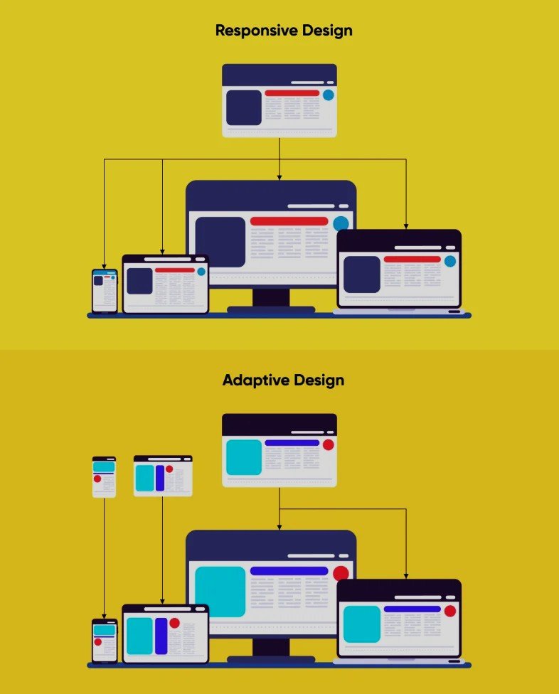
In today’s fast-paced digital world, ensuring your content looks great on all devices is not a luxury; it’s a necessity. Mobile-friendly layouts provide a seamless experience for users, whether they’re browsing on a smartphone, tablet, laptop, or desktop. These adaptive layouts ensure your website maintains its functionality and aesthetic appeal across diverse screen sizes.
Optimized for All Devices and Screen Sizes
Our mobile-friendly layouts are expertly designed to adapt dynamically to all devices and screen dimensions. Unlike static designs, these layouts are built with flexibility in mind, offering consistent usability regardless of the platform. Whether your visitors are navigating a small smartphone screen or an expansive desktop monitor, they will enjoy a unified and effortless browsing experience tailored to their needs.
User-Centric and Easy to Implement
Creating an engaging user experience is at the heart of these designs. Mobile-friendly layouts offer fast loading times, intuitive navigation, and visually appealing aesthetics that minimize frustration and maximize satisfaction. Not only are these layouts designed for end-users, but they are also simple to implement, ensuring developers and content creators can integrate them into existing websites with minimal effort and maximum results.
Boost Your Online Presence with Responsive Designs
Search engines increasingly prioritize user-friendly websites, making mobile adaptability essential for maintaining competitive visibility online. By integrating mobile-friendly layouts into your site, you improve your SEO performance and attract more customers, ensuring both aesthetic appeal and functional excellence. Give your audience what they value most: a top-tier browsing experience, no matter how they access your site.


Reviews
There are no reviews yet.